
Google Calendar
Every time we use google calendar we wish for it to be more personalized, to make it "our own". While it's very convenient to manage our time from our devices, it's hard for us not to "decorate" our plans like we used to from our daily journal. When we color or make a bold text or even add an image to it, it is easier for us to remember what we wrote, but more on that later.
Another issue that we wanted to deal with, was about some of the features in Google calendar that we always wanted to improve and add more of our own that we think could make people very happy :)
The problem
The way we see it, Google Calendar is a great platform, but at the same time, there are some aspects in which it is lacking.
The actions you can make in Google Calendar are limited, slow, and require too many clicks and guesses. In our opinion, the options are not accessible enough, and finding them takes too long and is frustrating.
Another thing that came up from using this product is the fact that it's has a technical and cold vibe, which lacks the personal and warm side that makes it a daily planner. If you examine the mental model of a planner, you can see that the user has a wider range to operate within when it comes to the design and visual aspects. This is because everything is done by hand in them, and the possibilities are endless.


Competative analysis
Themes
Many of the calendars we reviewed offer an option to visually change the calendar by choosing a color that will apply to the it.
Cleanliness and minimalism
Most calendars have a white background with a delicate calendar grid in a light gray color.
Adding icons and / or illustrations
Very few of the platforms we tested contained an option to add icons or illustrations.
Fixed menu on the left
Almost everything that is shown on the calendar is also shown on the menu on the left side of the screen.
Quick typing of an event or task
On some of the platforms we tested, we found that you can type in an event or task quickly by clicking on the calendar without moving to a new screen.
Postponement of a joint event
If there is an event that includes several participants, you can see everyone's diaries and set a new time for the event.

User research
Historically, if you review the usage of calendars, you can see that in the early 2000's a transition from analog to digital happened when Outlook and Google electronic calendars replaced the physical paper and the digitalization revolution really changed the way we write down our plans.
In recent years, there has been a growing trend of going back to pen and paper. On Instagram, for example, the hashtag #planneraddict is approaching 4.8 million mentions, and it seems that many people are turning to use the old physical way.

While trying to understand the reasons and motives behind this turning point, we have compiled a list of advantages for both platforms.

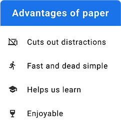
From this analogy, it is clear that despite the many benefits digital has, the paper platform looks no less attractive. From analyzing the advantages, we concluded that the act of writing is what attracts people to use pen and paper. Indeed, it is fast, it helps us remember better, it's simpler to edit and customize, and most importantly, it is fun.
Moreover, many studies have found that the human brain learns to create a mental representation of the text and anchor it to the structure (in other words, visual memory) when we choose its visibility and the way it is represented to us in reality.
Survey
To further understand this phenomenon, we surveyed potential users of both platforms. In the survey questions we examined the respondents' usage habits in the various calendars and the reasons that motivate to these behaviors.
65%
Use the calendar to manage their agenda
73%
Use the calandar as
a daily planner
52%
Use the calendar for their personal needs
Another interesting thing that was shown in the survey shows that a significant percentage of respondents (38%) said that they often prefer the familiar physical daily planner over the digital one.
The majority answered that the act of adding events and editing them in the physical planner is easier and more accessible and that there is an advantage for writing by hand when it comes to visual memory and the experience of using the product.
Solutions
In the following solutions, you will see that it is possible to take the main features of the daily planner, refine them, and transfer them in a clever way to the computer.
These features will not only make the user's events and tasks less burdensome but will also work with his visual memory in moments of stress, where it is more difficult to rely solely on the event color, or the text that explains what it is.
Event appearance on the calendar
In the first stage, considering the conclusions from our study, we chose to upgrade the presentation of an event on the calendar. Nowadays, the events on Google Calendar all look the same, and the only adjustment the user can make is to choose a different color for each of them.


Editing an event - click event
A review of Google Calendar's options showed that there are currently two different ways to edit an event, one that is basic and one that is more advanced. In the detailed description that we are going to present, we will show the existing options and our suggestions for improving each of them, and we will also show a third way of editing, that does not currently exist.

Current
When the user clicks on the event once, a window opens on the side of the event where its details are displayed. To edit these details, the user must click on the "Edit" button at the top of the window that takes him to the advanced editing mode in a new window.
Editing an event - double click

Current
In the current state, when the user double-clicks on the event, it takes him to a new window where there are different categories that he can fill in/ change according to his needs. This window shows the user advanced editing options.
Editing an event - right click on event
Current
In the current state, when you right-click on an event, a small "window" pops up with several basic editing options.
Suggested
1. Here, we have chosen to increase the editing options to provide the user with easier access to basic editing options.


2. When you click on the event, a small pop-up window shows up where the user can search for an address or paste an address of the site he wants to insert.
3. After saving the link, the user will be able to see the link on the event via an icon, and when he moves his mouse over it, he will be able to see the address and access the site.

Customized calendar
The user survey we conducted and the research we did lead us to think of a daily planner that would be both practical and fun. Our expectations were very high, yet we did several attempts that were less in line with the vibe of the platform while coming to understand that there is a reason why the calendar is minimalistic and clean, and the options it offers are limited.

Choosing themes
As you can see, we came up with "Themes" from which the user can choose and check them. Each theme includes a background image, main colors that are taken from the image itself, and a matching font. All of these can be edited and changed after selecting a certain theme.
The main problem with this idea is the clutter created by the multiplicity of colors and shapes from the background image along with the variety of event colors on the board.


After several attempts we proceeded to...
Version 2
We did not want to give up on the personal aspect that is missing in the original calendar, so we tried a slightly more minimalistic direction - changing color in a more clever and specific way as with buttons and highlights, changing the font of the calendar itself as well as the text when editing events, adding stickers, and adding an image to the event.

Current
The calendar as it right now shows the user a scaled-down calendar on the left and the rest of the calendars the user can add to his own calendar.
Themes
The purpose of the "Theme" section is to provide a partial solution to the user's need for a more personalized calendar by choosing the main color and choosing a font from the list of fonts offered to him. After clicking on "save," the theme is implemented in the calendar.

Conclusions
Working on this project was very instructive and opened our eyes regarding quite a few aspects. The long research we conducted and the user survey directed us to what we and other users of Google Calendar are missing and we used this knowledge throughout the process.
We learned how to simplify complex ideas to be more user-friendly so that he both enjoys using the product and also manages to find the features he is looking for easily and use it comfortably. In addition, we found that what works in other Google products and other companies we researched, such as the backgrounds in Gmail, will not necessarily work well in Calendar.
There are other challenges we were interested in cracking later on, like adding checkboxes of tasks on the board and how to differentiate them from the events themselves and rethinking mobile adaptation based on the changes we made in this project.