
Hamburger stand
Rainbow is a vegan and non-binding Tel Avivian street food stand. Rainbow prides itself on being able to provide burgers that are not only 100% vegan, but also delicious and very close to real beef. They put the customer at the center and talk to him at eye level, it is very important for them to know what he thinks and they are interested in getting better through it. They do not take themselves too seriously, they are young, light-hearted and Tel Avivians.
The challange
Rainbow had no website and no branding design other than its logo, so I had to do some research online on its Facebook page and at its location in TLV. It was clear that it conveys cuteness, humor, diversity and youth.
Role
UX & UI design
Year
2020

Competative analysis
1. Hero image
All the sites I checked had a large and impressive picture of the product in any form, whether as an illustration or as a photo.
2. Updates / Sales
Many of the restaurants update their customer regarding sales or new dishes in the menu on its website.
3. Cognitive overload
Quite a few sites use a number of different fonts and text sizes and vary, dividing each part of the site into different colors and delimiting it or using colored patterns.
4. About
Many restaurants choose to pitch themselves to the customer and explain about their values and goals.
5. Menu
Some restaurants choose to refer the customer to a menu or order delivery from the home page and list in a short text about their specialty.

UX architecture
I decided to make a standard flow for the user that when I'll get to the design part of the process, I will have a much more creative freedom. Rainbow have three important values that needed their own noticeable place, with a short, effective and to the point text.

Design
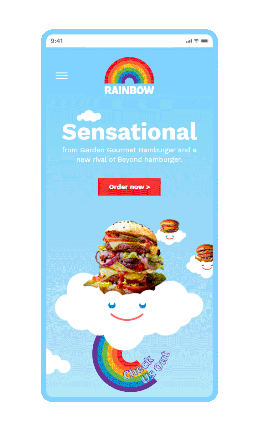
I knew i want a big and impressive Hero image that reflects Rainbow, something that will be a great eye catcher with a bold CTA button. The casual and happy feeling coming out of Rainbow's logo and their food stand at TLV, dictates the design I chose for their site. The same rainbow that appears in the logo, I decided to develop and display it in all sorts of shapes and ways, with the addition of cute and smiling clouds and the overall color.


Conclusions
I chose Rainbow because they make my favorite vegan burger. I loved their casual language and the values they bring to the table. All of these led me to create the website template I had imagined, after understanding the essence of Rainbow. I took the rainbow and used it in different ways to explain the main facts about Rainbow, but also as a graphic language that reflects its personality.