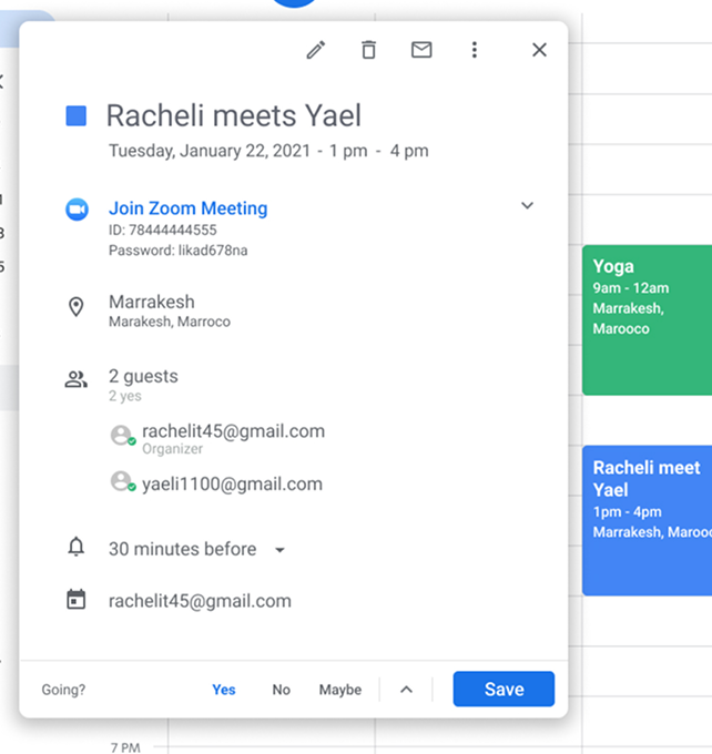
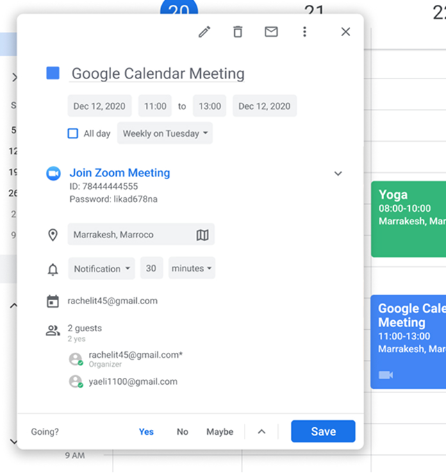
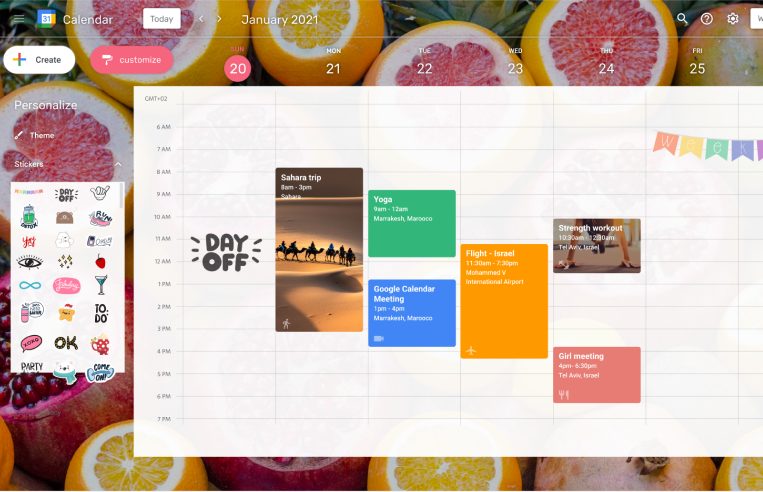
UX transformation

Google Calendar

Google Calendar is powerful but often feels impersonal. This project explores how to make it more personal, warm, and user-friendly without losing its core functionality.
Role
UX & Research
UX Course
Codesigner
Tools
Figma

Goal

Create a more personal and accessible Google Calendar experience through visual customization and simplified editing.

The Challenges

Google Calendar, while powerful, presents several key challenges in both functionality and user experience.
Cold and technical interface
The design lacks warmth and personality.
Hidden functionality
Useful features exist but are buried or hard to discover
Too much time spent
Simple tasks require too many clicks

Competitive Analysis

A quick comparison of design and UX patterns found in leading calendar tools.

Custom calendar colors

Users can choose colors for their calendar view.
Competitors
Google Calendar

Clean white layout

White background with a subtle gray grid.
Competitors
Google Calendar

Icons or visuals

Visual elements are rarely supported.
Competitors
Google Calendar

Fixed Left Menu

Events appear in both the calendar and menu.
Competitors
Google Calendar

Quick event entry

Add events directly by tapping the calendar.
Competitors
Google Calendar

Reschedule with others

Easily find a new time for shared events.
Competitors
Google Calendar

User Research

In the early 2000s, calendars went digital with tools like Outlook and Google. Over the past decade, paper planning made a comeback with #planneraddict reached nearly 5M mentions on Instagram.
To understand this shift, we listed the advantages of both formats.
Paper remains appealing because handwriting is fast, personal, and memorable, helping us form stronger visual and mental connections.

Survey
To better understand this, we surveyed users about their calendar habits and the motivations behind them.
65
%
Use it to manage their agenda
73
%
Use the calendar as a daily planner
52
%
Use it for their personal needs

Solutions

Event visibility

Current
Today, all events look the same and customization is limited to color choice. To better match user preferences, we defined several enhancements
Suggested
  1. Resize title for better orientation
  2. Add background image to events
  3. Add link/attachment icon
  4. Add icon to indicate event type

Quick editing

Current
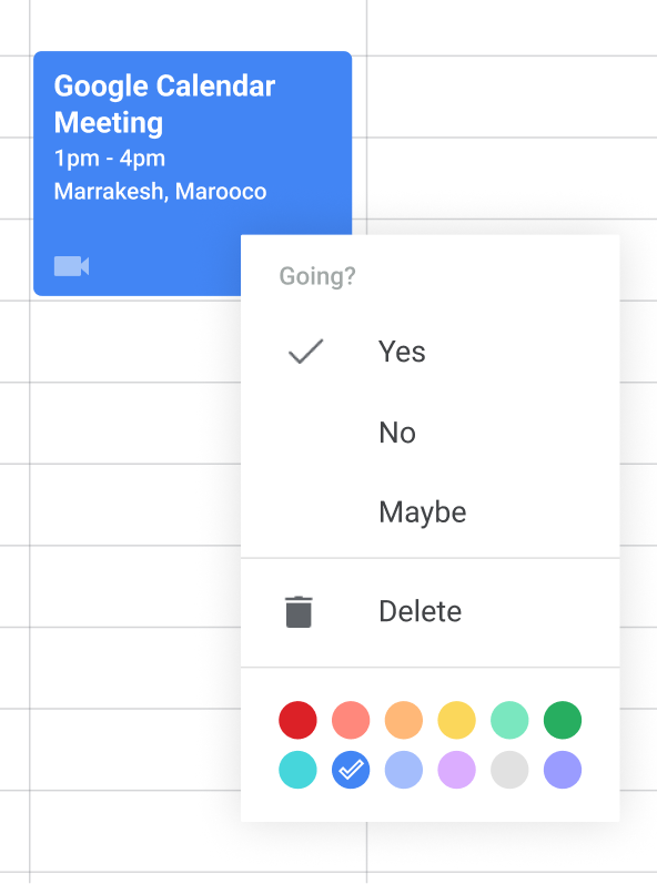
A single click on an event opens a side panel with its details. To edit, the user must click the edit button, which redirects to advanced editing in a new window.
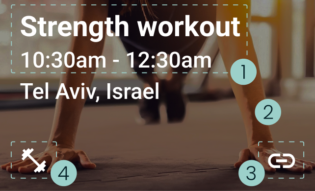
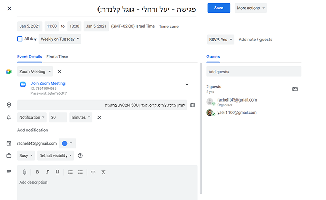
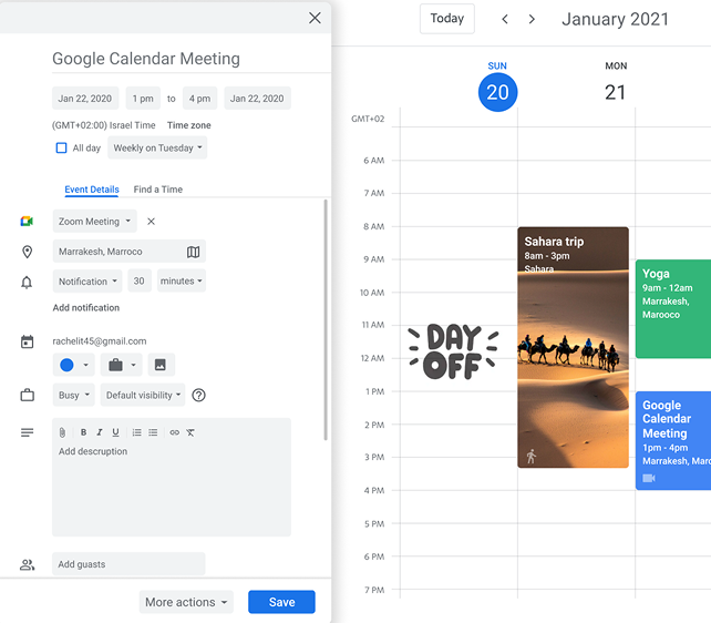
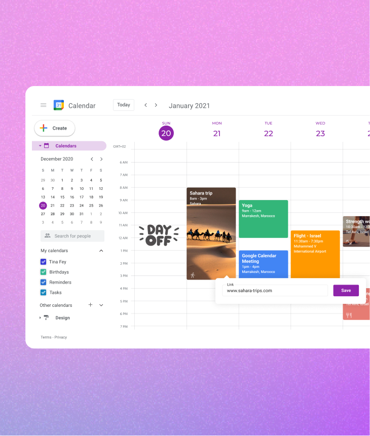
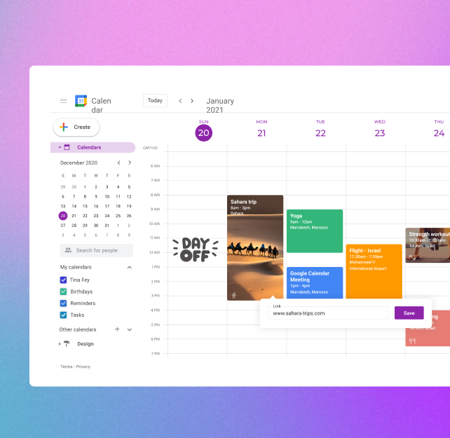
Suggested
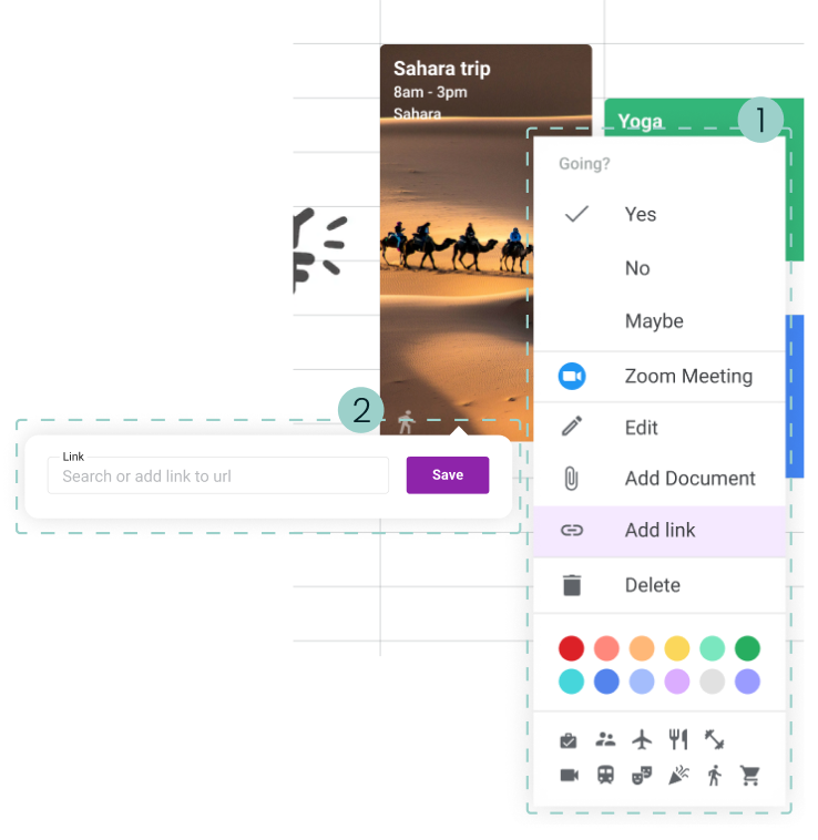
To simplify use, the event panel will allow direct editing of details, which will update instantly on the board.

Advanced editing

Current
Double-clicking an event opens the advanced editing mode with editable categories and tabs for details or "Find a time."
Suggested
Double-clicking an event opens advanced editing in a side panel, keeping the calendar visible and adding options for an icon and image.

Customized event

Customized event

Current
Nowadays when you right-click on an event a "Drop Down" opens with a number of basic editing options.
Suggested
  1. We expanded the editing options to give users easier access, focusing on adding a link.
  2. When clicking the link option, a popover opens, allowing the user to search or paste a site address.

Customized calendar

Customized calendar

Theme Selection
The user chooses from preset themes with background, colors, and font, then customizes it as desired.
The user can choose from preset themes, each with a background image, matching colors, and a font. After selecting a theme, the user can further customize and adjust it as desired.
The main problem is the clutter created by the multiplicity of colors and shapes from the background image along with the variety of event colors on the board.
Final version
To retain a personal touch, we chose a minimalist approach: custom colors, font changes, stickers, and event images.

Conclusions

Throughout this project, we faced several challenges that deepened our understanding of how users interact with Google Calendar and how design decisions affect usability and personalization.
  1. Balancing minimalism and personalization required careful design choices.
  2. Deciding what to edit on the board versus side panels raised hierarchy and efficiency questions.
  3. Adapting patterns from other Google products showed not all solutions fit Calendar.
Results
We would also explore adding tasks as checkboxes within the calendar, examining whether this approach could enhance usability or create visual clutter.
Projects
Paz Charge
Google Calendar
Bank Leumi
Mix & Drinx
About Me
Reach Out - I don't bite