Israel's EV market is expanding fast, with 210,000 EVs expected by 2025 and growing demand for public charging. Despite rising search interest, Paz Charge's site underperformed in rankings.
To address this, I partnered with the Product Manager to audit the site, restructure content, and design pages aligned with.
Role
UX/UI & Prototype
Workplace
McCann
Tools
Figma & Photoshop
Goal
The project aims to establish Paz Charge as the premier solution for EV charging, boost brand awareness for public charging stations, and increase app downloads.
The Challenges
The old website showed poor UX with sharp drops in interactions, low engagement, high form abandonment, and heavy reliance on paid traffic.
31
%
Engagement rate.
1.2
%
From submit and C2C.
1:30
min
Average time on page.
Site Map
Homepage
Advantages
Charging stations map video
Charging stations types
Charging speeds
About Us
Q&A
Download app barcode
Contact us
Paz Corporation site
Useful information
Subject filter
Download app barcode
Fleet vehicle & companies
Advantages
Pazomat charge
Contact form
Download app barcode
Public charging stations
Advantages
Pazomat charge
Contact form
Download app barcode
Charging stations map
Charging stations map feature
Download app barcode
Personas
Paz Charge
Brand
Established
Reliable
Accessible
Goal
Establish Paz Charge as a trusted, eco-conscious leader in electric vehicle charging.
Encourage drivers to charge their vehicles via the Paz Charge app.
Motivations
Paz Charge has an extensive and expanding network of strategically located charging stations.
Pain Points
It can be challenging to persuade electric vehicle owners to switch from home charging to public charging options.
Roei Levi
Brand
Established
Reliable
Accessible
Goal
Fast, accessible charging at key locations
Simple app for charging and payments.
Reduced home charging without compromising convenience.
Motivations
Minimizing wait time during charging.
Affordable rates and rewards.
Clean energy for a greener future
Reliable backup to home charging.
Pain Points
Complex banking tasks often feel time-consuming and overwhelming.
Charging time is long compared to gas refueling.
UX Audit
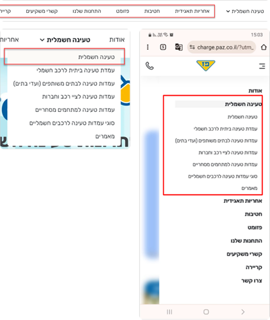
Navigation pain point
The most important categories are hidden within a dropdown element labeled "Electric Charging", while the remaining categories redirect users outside the site, leading to user abandonment.
Articles & Charging Station Information Pages
Pages are heavily loaded with textual content, making it overwhelming for users to navigate and comprehend. Additionally, there is a lack of visual elements such as icons, images, or infographics that could break up the text, enhance readability, and improve user engagement.
Wireframes
Recommendation-Driven Wireframes
The wireframes focused on improving navigation, highlighting strategic keywords, and enhancing the user experience while optimizing for search engine requirements.
Design
Navigation
Navigation
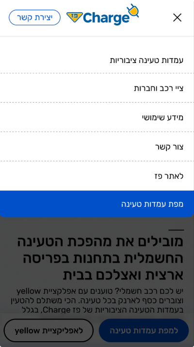
Main menu
Adding "עמדות טעינה ציבוריות" and "מפת עמדות טעינה" to the navigation menu simplifies access for users, encourages charging at Paz Charge stations, and increases app interaction.
On desktop, the navigation is fully visible at the top of the page, while secondary items are placed in the footer to keep the layout clean and focused.
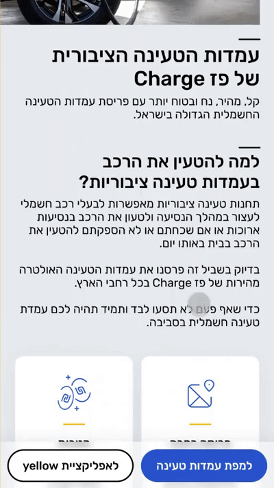
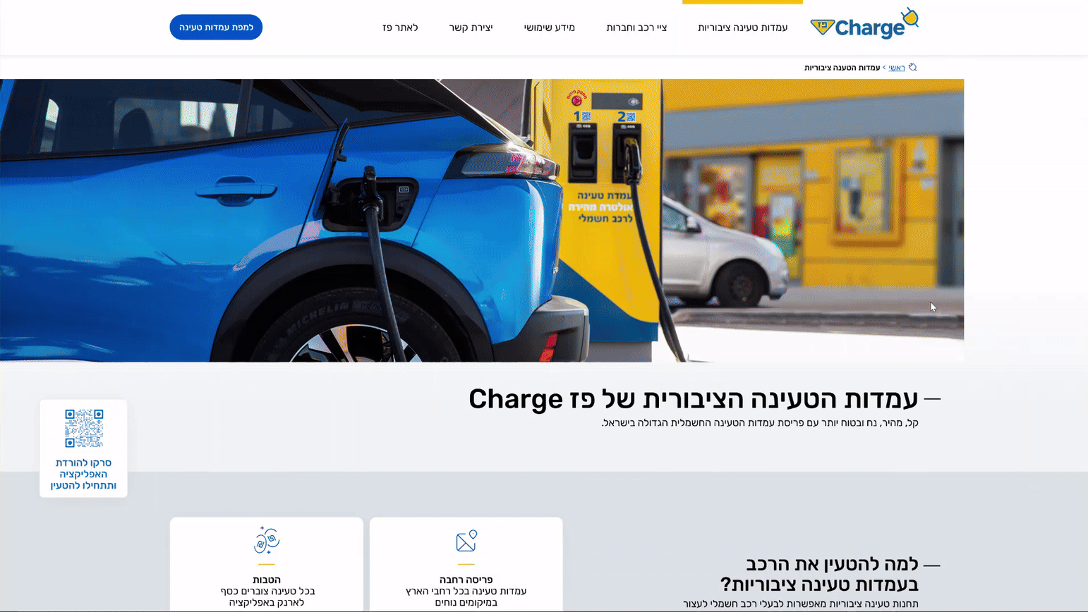
Sub menu
To improve user experience and ease navigation, I added a secondary menu for quick access to different sections of the page.
On desktop, The secondary menu on desktop is placed on the right, making it easier to navigate long content without cluttering the layout.
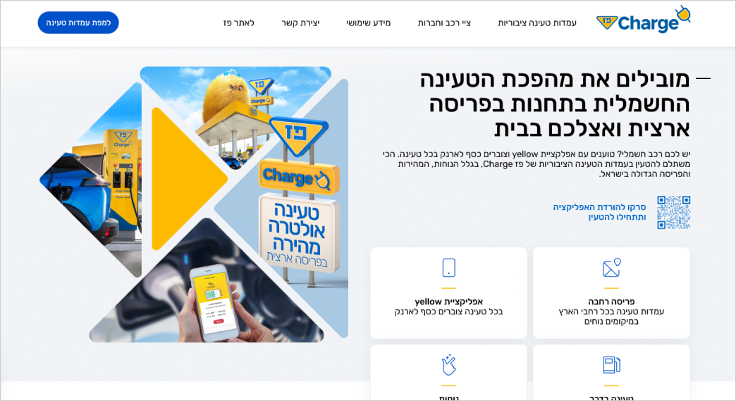
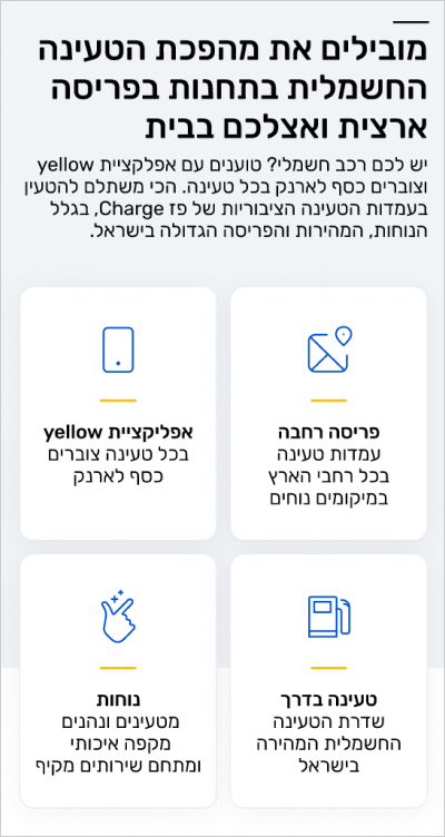
Homepage - Promoting Campaign Objectives
Benefits
Main benefits were presented in icon-based cards to make them clear, prominent, and easy to understand.
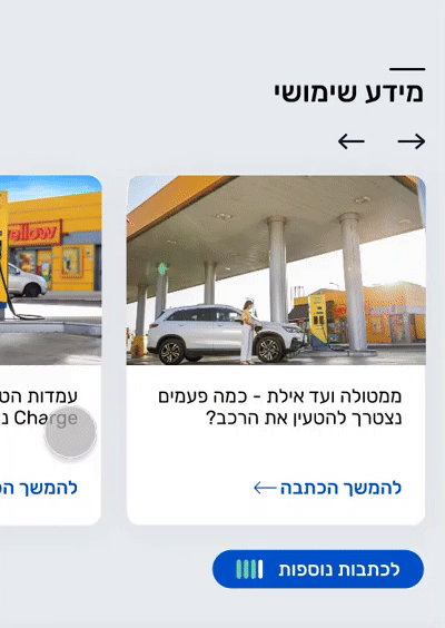
Article carousel
Included an article carousel on the homepage to boost engagement and improve SEO.
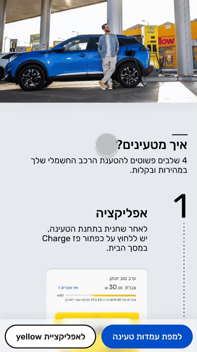
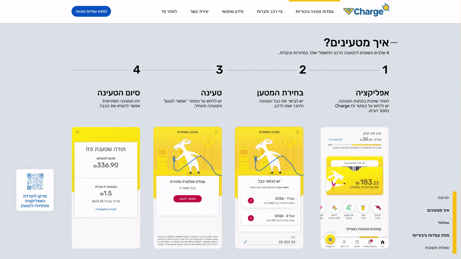
Charging guide
Charging guide
Step-by-step on-scroll animation
Each step is clearly visualized and explained for easy charging, with animations triggered on scroll to guide users through the process.
Full process overview
Side-by-side layout with smooth step-by-step animation makes the process easy to follow.
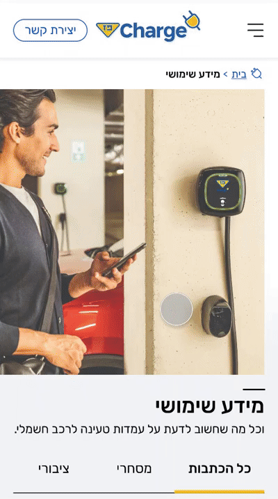
Useful information - articles
Tab navigation
Articles are organized into "ציבורי", "מסחרי" and "כל הכתבות", making it easier for users to find the information they need.
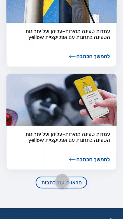
Load more button
Loading button with infinite scroll reveals 5 more articles per click.
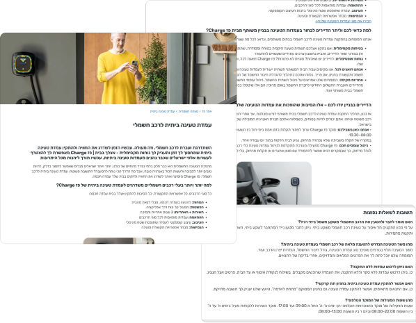
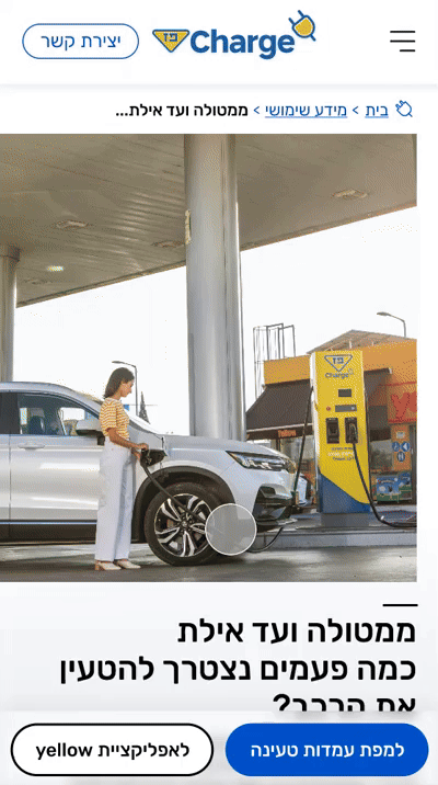
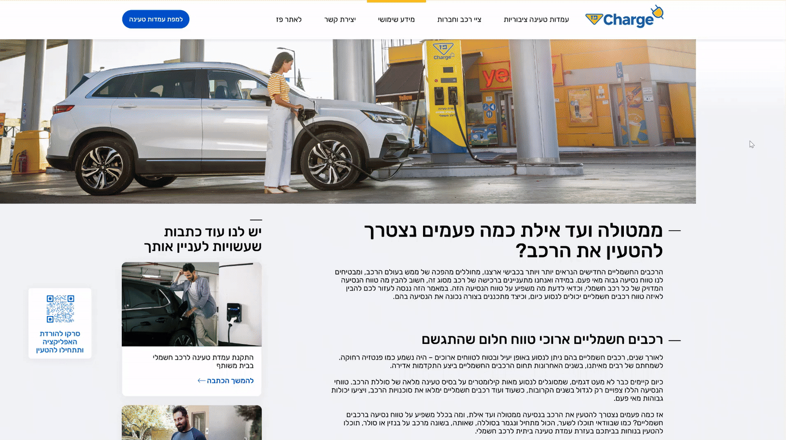
Article page
The article page is reached via the "מידע שימושי" page, with breadcrumbs for context. Content was redesigned with headings, shorter paragraphs, and images for easier reading and navigation.
On desktop, "כתבות נוספות שעשויות לעניין אותך" is placed next to the article, making it easier for users to discover related content while reading.
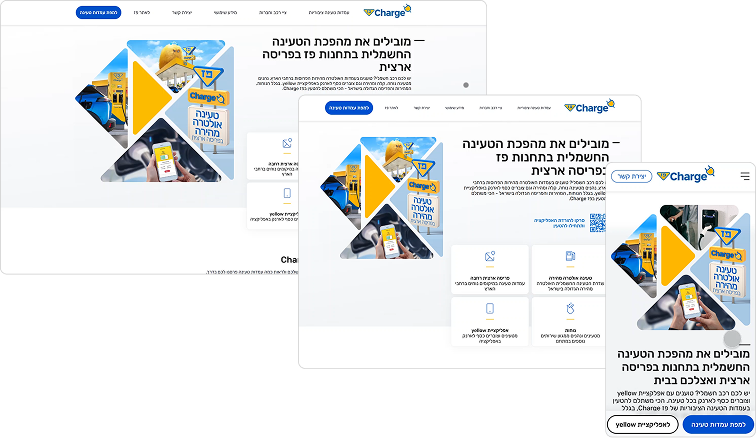
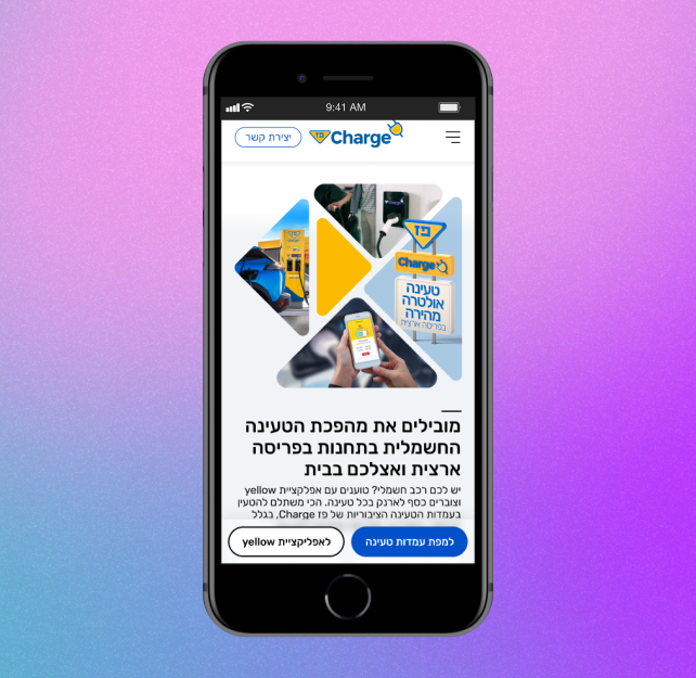
Responsiveness
The design has been adapted for three different screen sizes, ensuring a comfortable and precise user experience across all devices.
Conclusions
This project focused on improving content, visibility, and engagement around public charging.
Despite time constraints, close collaboration led to measurable impact across key metrics.
Content Restructuring: from dense content to readable sections with visuals.
User Flow Optimization: simplifying access to public charging info and the app.
Improved navigation and SEO: through a new menu structure and clearer content categorization for better visibility.
Results & additional Improvements
Engagement rose to 57%, conversions to 2.82%, and users now spend over 3 minutes per page.
Site improvement: old vs. new
With more time, I would have deepened user testing, improved article discoverability with tags and filters, and further enhanced the charging map experience.