App Concept & UX Design

Mix & Drinx

Mix & Drinx is a cocktail app concept I designed for flavor experimenters.
Users can create customizable bottled cocktails and get them delivered straight to their door, perfect for hangouts, celebrations, or movie nights.
Role
UX & UI Design
Micro-copy
Branding
Tools
Figma
After Effects
Illustrator

Goal

Make custom cocktails accessible at home, so people can enjoy social gatherings and celebrations without going out to crowded or expensive bars.

The Challenges

I wanted to capture the joy of social drinking in a home setting, especially relevant during Covid-19 restrictions, while keeping the experience seamless and fun.
Intuitive Exploration
Offering a vast range of flavor profiles and ingredients without overwhelming the user.
Gamified Utility
Integrating playful engagement without compromising the core ordering flow.
The Home Experience
Translating the premium bar service experience into a contactless, home delivery model without losing the sense of craft and care.

Competitive Analysis

Comparing the UX patterns across leading cocktail and drink delivery apps, to see which conventions to keep and where Mix & Drinx could stand out.

Age limit

An age-verification pop-up or sign-up asking if the user is over 18/21.
Common

Recommendation

User recommendations, reviews, favorites, and ratings.
Common

Images & illustrations

Strong emphasis on eye-catching visuals, product images or colorful illustrations.
Common

Store

Store with accessories like beverage-specific glasses and ready-made cocktail packages.
Common
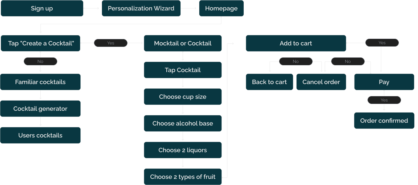
User Flow

Wireframes

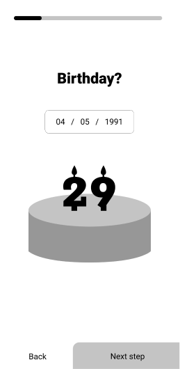
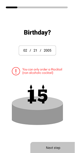
Birthday Verification
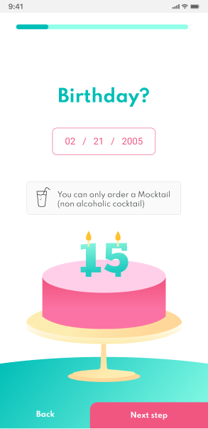
Instead of a simple yes/no checkbox, I designed a date-of-birth input to create a more deliberate and trustworthy experience.
This also allows the system to automatically guide underage users toward non-alcoholic options.
Making it engaging
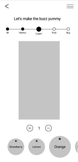
In early wireframes, I mapped out the cocktail creation flow and identified gaps in ingredient clarity and step navigation.
These insights led me to strengthen the visual hierarchy and make progression between steps more intuitive.
Order review
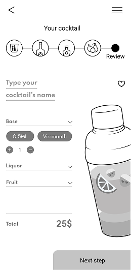
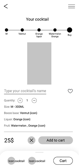
To reduce order errors, I designed a structured review screen where users can easily verify and adjust their cocktail before adding it to the cart.

Design

Onboarding

Onboarding

Date of birth
To handle age restrictions early on, I introduced a date-of-birth step. The experience adapts for underage users by offering non-alcoholic options instead of blocking them.
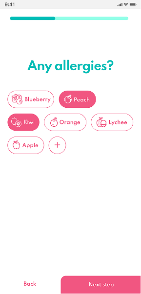
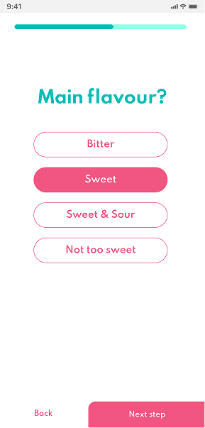
Personalization
To personalize the experience from the start, I introduced allergy selection and flavor preference steps, both are optional to keep onboarding lightweight and avoid overwhelming new users.
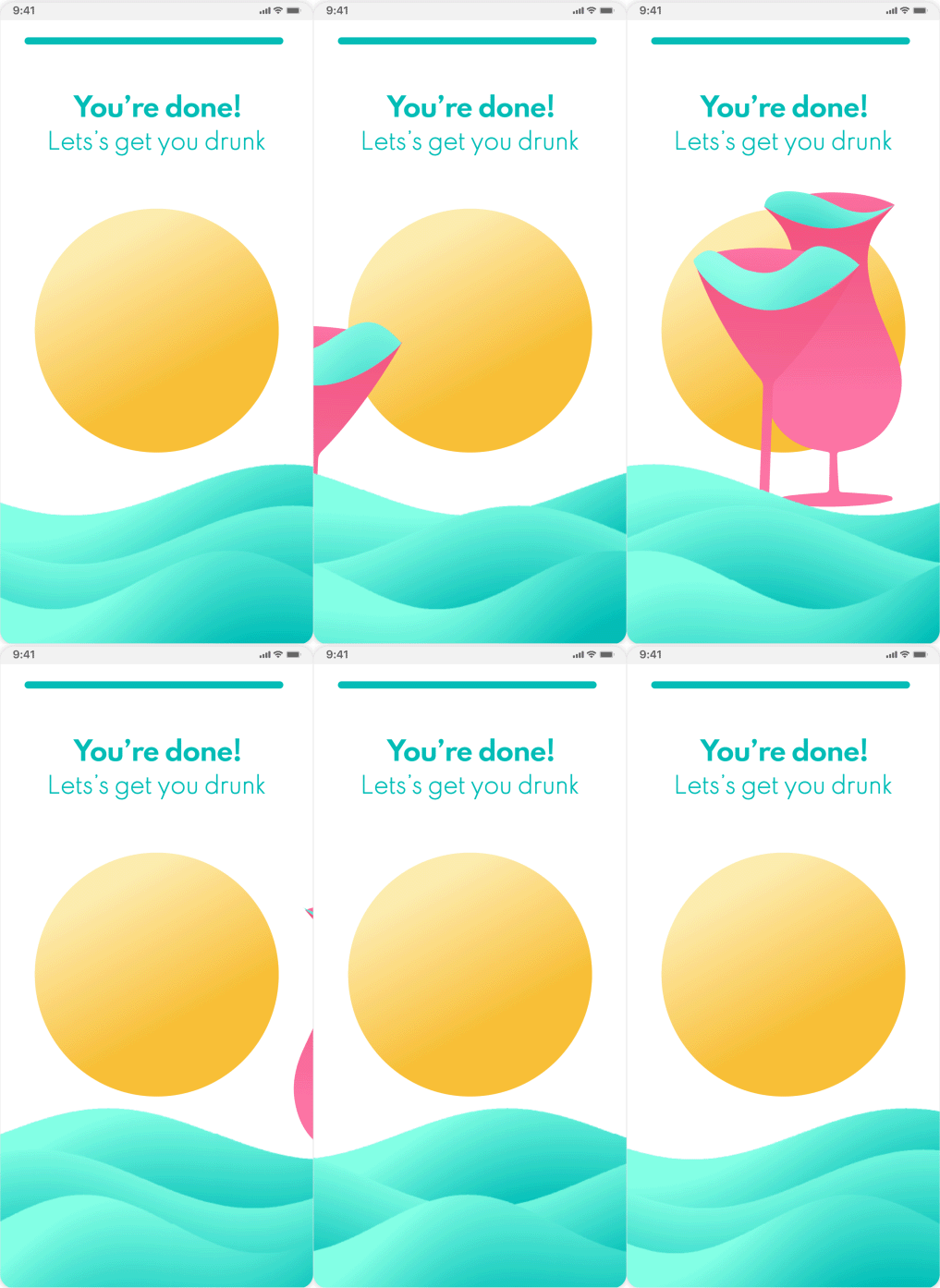
Onboarding Completion
I closed the onboarding with a playful cocktail animation to create a rewarding, celebratory moment before users enter the app.

Creating a Cocktail

Creating a Cocktail

Home
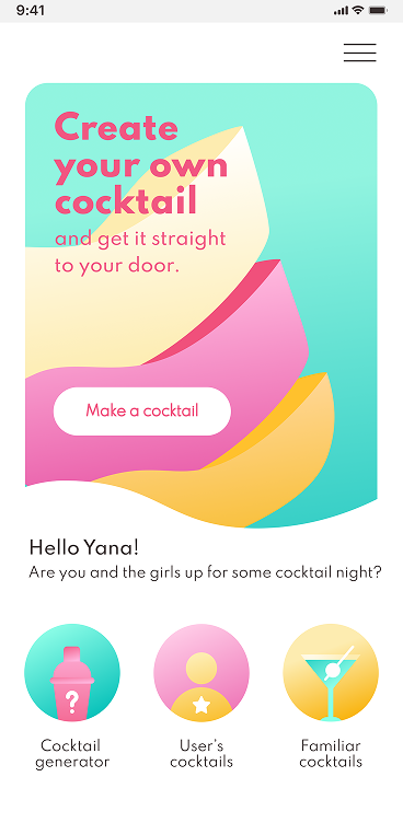
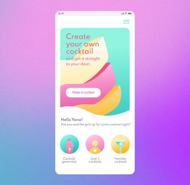
I designed the Home screen to support both creation and exploration, allowing users to either build their own cocktail or browse existing options.
Cocktail or Non-Alcoholic
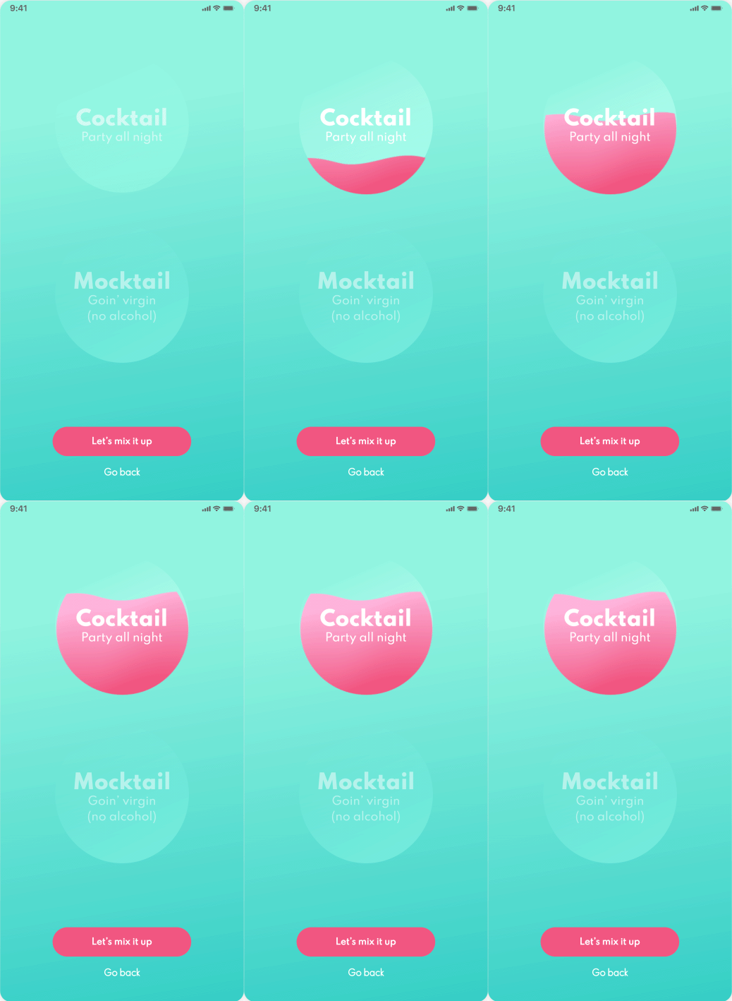
To support users who prefer or require non-alcoholic options, I introduced a Cocktail vs. Mocktail selection early in the flow, allowing the experience to adapt from the start.
Step-by-step ordering flow
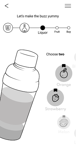
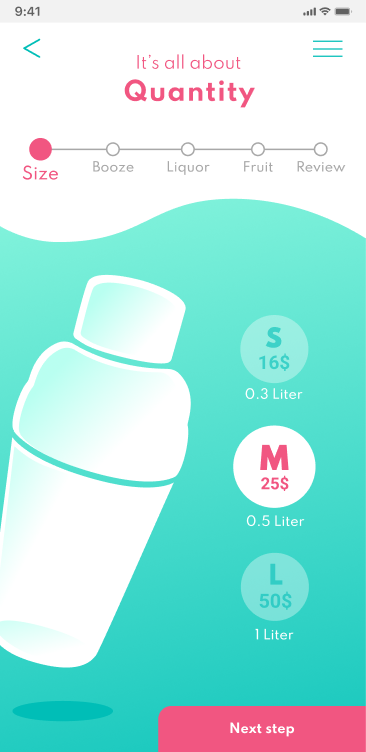
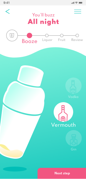
I structured the ordering flow into five steps with a progress bar that lets users navigate freely between steps to review and adjust their selections before confirming.
Choosing flavors & ingredients
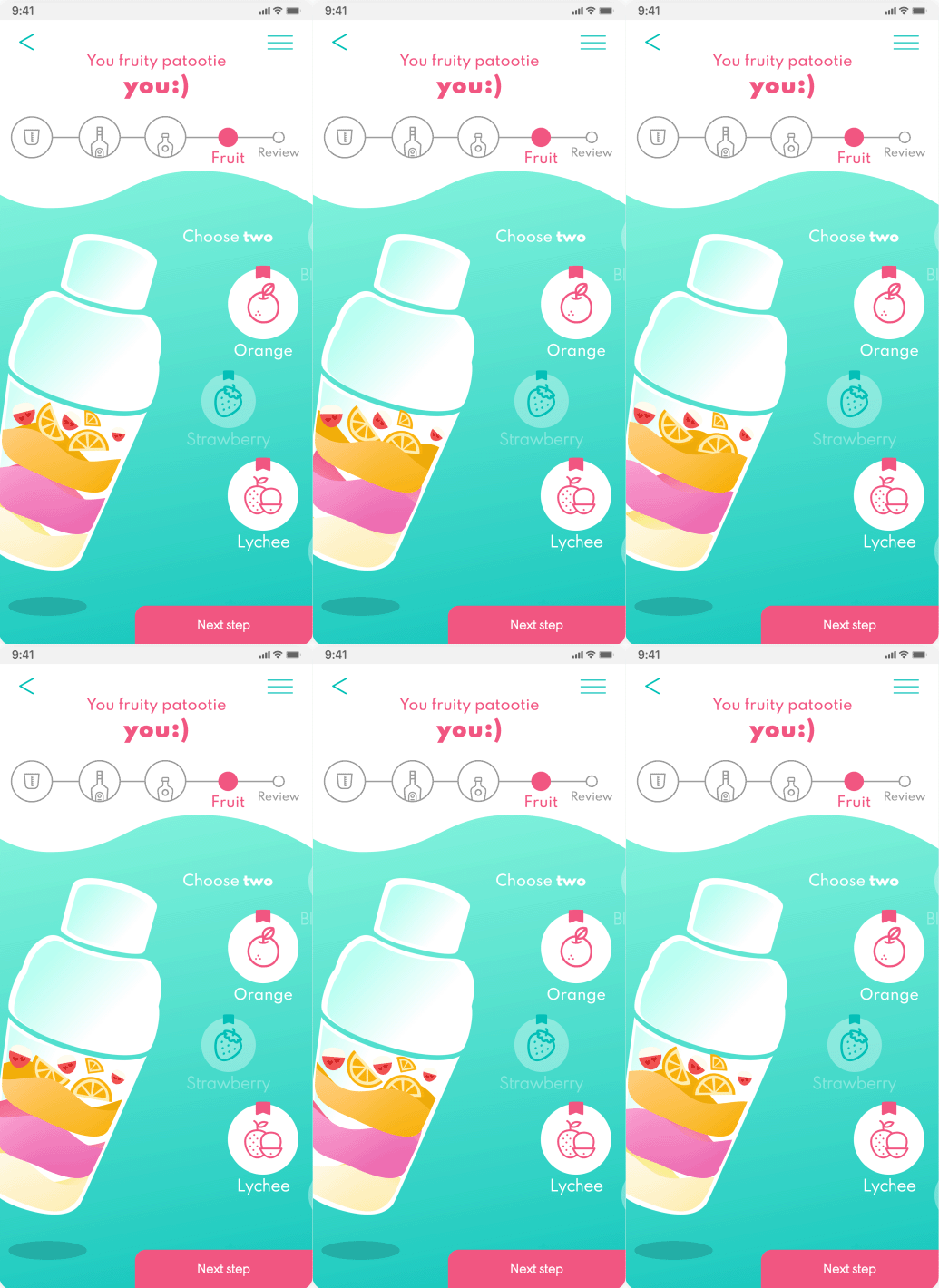
I designed the ingredient selection steps with pairing recommendations surfaced directly on relevant options, enabling users to make informed choices without leaving the flow.
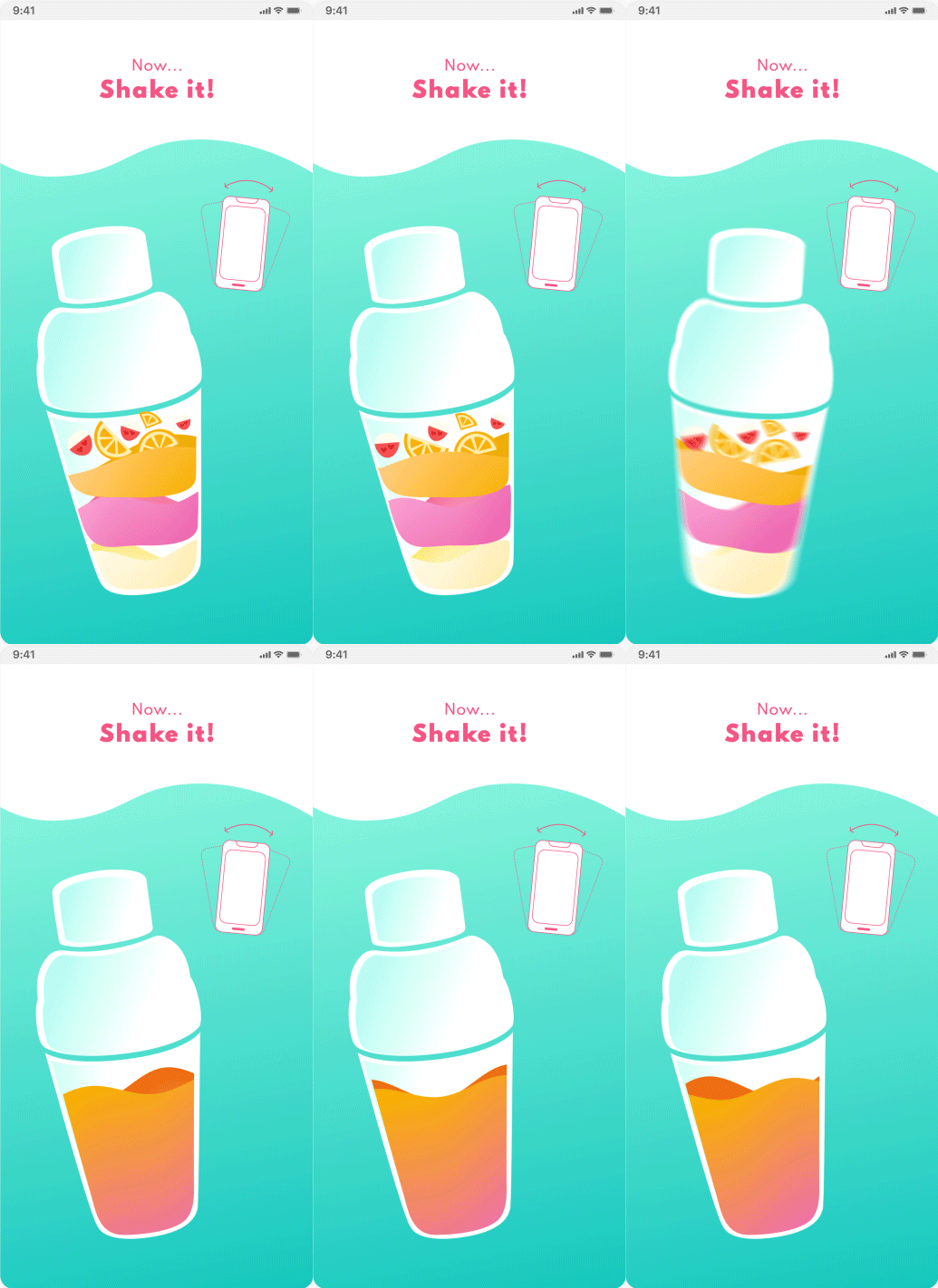
Shake Interaction
I ended the creation flow with a shake gesture interaction, turning the final mixing step into a physical and memorable moment before placing the order.

Customized bottle

Customized bottle

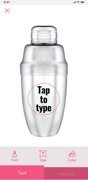
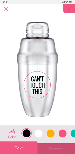
Personalized Label
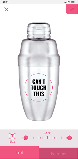
To give users a deeper sense of ownership, I introduced label personalization, allowing them to fully customize the bottle with their own text, font, color, and size. This turns the product from a drink order into something that feels uniquely theirs.
Design Options
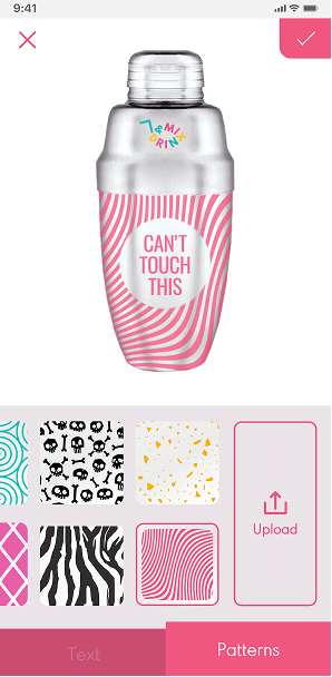
I extended this personalization by introducing pattern customization, allowing users to choose from curated designs or upload their own.
Order Tracking
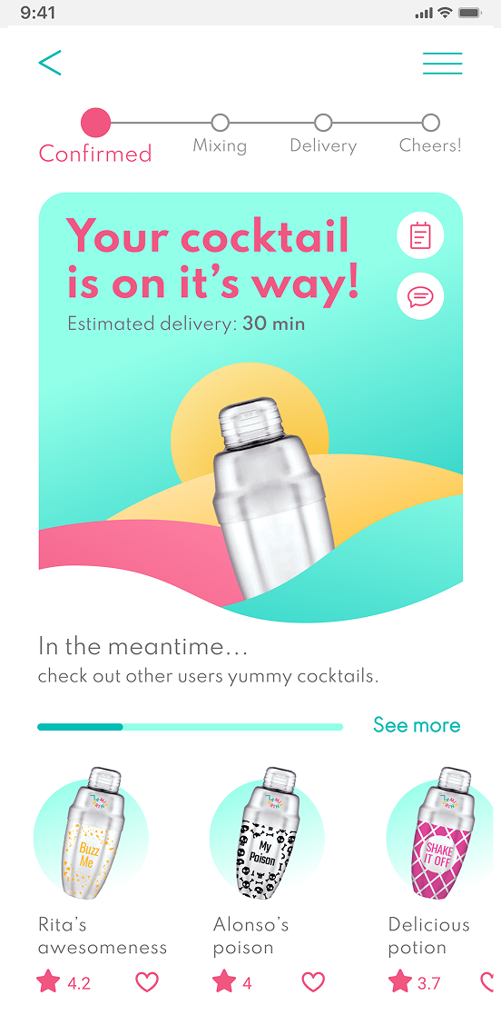
To reduce uncertainty after checkout, I designed a tracking screen with clear delivery updates. While waiting, users can browse other cocktails for inspiration.

Conclusions

This project marked my first end-to-end UX process, taking a concept from research to a complete product experience. Through this process, I learned:
  1. The importance of clear visual hierarchy and accessibility in guiding users through complex flows.
  2. Personalization works best when it is based on users' choices and behavior.
  3. Providing context for each step helps users better understand the process and stay engaged.
Looking ahead
As a next step, I would validate key flows through usability testing, particularly the onboarding and cocktail creation experience.
I would also improve color contrast for better accessibility, refine the order tracking experience, and explore ways to make personalization adapt to users' past choices and preferences.

More Projects

Xplanner

UX Strategy & UI
Information Architecture
Branding
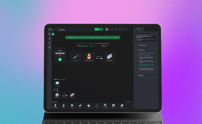
UX research and design for an early-stage scientific platform, covering strategy, information architecture, and branding.

Paz Charge

UX Design
UX audit
UI Design
Prototyping
A redesign based on UX audit, site architecture and brand aligned UI design.
Projects
Paz Charge
Google Calendar
Xplanner
Mix & Drinx
About Me
Reach Out - I don't bite